Intro to Matplotlib

Introduction to Matplotlib
Matplotlib is a Python visualization library that provides a variety of tools and functions for creating static, animated and interactive graphics and visualizations. It is one of the most popular and widely used libraries in the Python community.
pyplot is a module of the Matplotlib library that provides a simple and intuitive interface for creating plots. It is typically the module used by Machine Learning and data science engineers for their graphical representations. Specifically, the key points of this module are:
- High-level interface: pyplot offers a number of functionalities that facilitate the fast creation of graphs.
- Functionality: It offers a wide variety of functions for bar charts, dot plots, box plots, and so on.
- Integration: It is tightly integrated with environments such as Jupyter Notebook, allowing graphs to be displayed directly within notebooks.
import numpy as np

X = np.linspace(0, 10, 100)
y = np.sin(X)
z = np.cos(X)
Line plot
The line plot represents information at points connected by lines. It is useful to show the evolution of one or more data series along an axis, typically time,
import matplotlib.pyplot as plt

plt.figure(figsize = (10, 5))

plt.plot(X, y, label = "Sen X")
plt.plot(X, z, label = "Cos X")

plt.title("Line plot")
plt.legend()
plt.show()
Scatter plot
The scatter plot shows individual values of two numerical variables on a Cartesian plane (with two axes). Each point represents one observation.
plt.figure(figsize = (10, 5))

plt.scatter(X, y, label = "Sen X")

plt.title("Scatter plot")
plt.legend()
plt.show()
Histogram
The histogram represents the distribution of a numerical variable by dividing the range of data into intervals and showing how many data fall into each interval (for continuous variables) or the frequency of each category (for categorical variables).
data = np.random.randn(1000)

plt.figure(figsize = (10, 5))

plt.hist(data, bins = 30, alpha = 0.7)

plt.title("Histogram")
plt.show()
Bar chart
The bar plot represents categorical data with rectangular bars with heights (or lengths, in the case of horizontal bars) proportional to the values they represent.
labels = ["A", "B", "C", "D"]
values = [10, 20, 15, 30]

plt.figure(figsize = (10, 5))

plt.bar(labels, values)

plt.title("Bar chart")
plt.show()
Pie chart
A pie chart represents data in circular sectors, where each sector corresponds to a category and its size is proportional to the value it represents.
labels = ["A", "B", "C", "D"]
sizes = [215, 130, 245, 210]

plt.figure(figsize = (7, 7))

plt.pie(sizes, labels = labels)

plt.title("Pie chart")
plt.show()
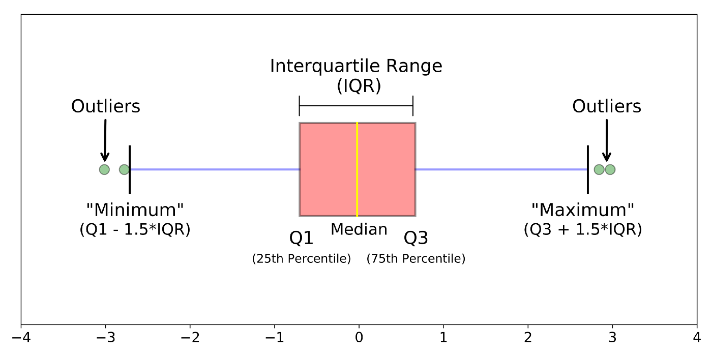
Boxplot
A boxplot shows the distribution of quantitative data by its quartiles and possibly outliers.

The ends of the box indicate the lower and upper quartiles, while the line inside the box indicates the median.
data = np.random.randn(1000)

plt.figure(figsize = (10, 5))

plt.boxplot(data)

plt.title("Boxplot")
plt.show()
Exercise 01: Create a scatter plot from the following vectors: x = [1, 2, 3, 4], y = [1, 2, 0, 0.5] (★☆☆)
Exercise 02: Create a line graph from the two vectors of the previous exercise (★☆☆)
Exercise 03: Create a histogram from a random array following a normal distribution (★★☆)
Exercise 04: Create a DataFrame from the Titanic dataset and display the distributions of age and cost of tickets (★★★)
NOTE: You can find the dataset at https://raw.githubusercontent.com/cvazquezlos/machine-learning-prework/main/04-matplotlib/assets/titanic_train.csv