Box Model
Layouts
HTML and CSS
CSS Layouts: Create and Build Layouts with CSS
The Box Model
CSS Layouts and the positioning of elements are probably one of the most challenging concepts in CSS; both were meant for older, less advanced and less rich websites.
Layout
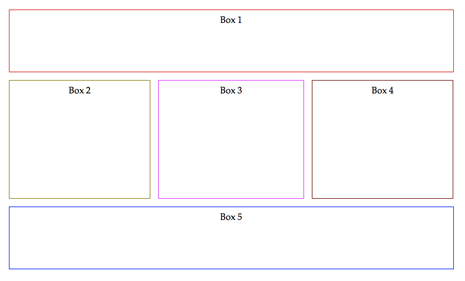
Let’s go back to HTML: How can I create documents with 2 columns? We know that some scientific documents have several columns, but how can I replicate that in a website?
We need to use boxes for it. A box is a container with a specific width and height. Boxes are containers that bring order into the HTML/CSS world. By far, the most used tag for a box is <div>.
All website content should be wrapped within boxes (div, header, footer, etc.). Boxes are invisible by default, so in order to make them visible, you have to either set a background color or a border. The following image shows how many invisible boxes a normal website has:
Box Attributes
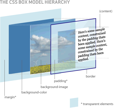
All box containers can have the following attributes:
| Attribute | Description |
|---|---|
| Content | Whatever elements are contained within the tag (the words in a paragraph, an image, the text in a list of items, etc). |
| Padding | This is an optional empty space or margin that can be added between the content and the border of the box. |
| Border | The line around the box and its content. |
| Background image | The image that is shown behind the box content. |
| Background color | In addition to the background image, you can also have a background color behind both the content and the background image. |
| Margin | Optional space that can be added between this particular box and other elements around. |
In the following example, we divided the website content into 2 different areas. The left side will be The menu and the right side will have The content of the website. We put a red color to the #div1 of the menu, and a blue color to the #div2 of the content so that the example is easier to understand.
The box-sizing Property
This important property is connected to the box model, and it defines how the height and width of the element are calculated: should include the border, padding and may (or may not) include the margin.
-
If the value is content-box, width and height will only be applied to the
contentof the element. -
If the value is border-box, width and height apply to all parts of the elements: content, padding, and borders.
Width and Height
All boxes have two attributes that define their size: width and height. In some cases they are adjusted automatically, but in others we must assign them manually or place them percentage-wise (relative to the parent content for example).
The Position Property
The browser is responsible for assigning positions to all elements of a page. However, as we know, the positions brought by the elements are quite limited and make the documents look both ugly and antiquated.
In order for a website to look like today's websites, we have to redesign the entire page positioning. This is achieved by using both the position property and the display property (which we will learn later on) so that we can replicate whatever layout imaginable by the most avid designer.
| Value | Description |
|---|---|
| Static | This does not involve any special positioning of the elements. As a consequence, the top, left, right and bottom properties are not considered. |
| Absolute | When you tell a box that its position is absolute, you also need to define the top, bottom, left, and right rules. Here, you are asking the box to ignore where it was positioned in the HTML document. Its new position will be based on the rules (top, left, right, and bottom that you specified in the CSS). |
| Relative | Similar to absolute. The main difference here is that its position in the HTML document is not ignored. The box will be located in accordance to the top, left, right, and bottom attributes, relative to its parent element as the starting point. |
| Fixed | If you fix an element, it means that it will always remain in the same position. When the user scrolls in any direction, the element will stay in the very same position. "Fixed" could be used on PopUps, menus, etc. |
Wait!! If you don’t get what we just explained, well... there's nothing to worry (at this current stage). This is one of those things we need you to practice a lot. There is no other way. 🙁
The Display Property
The values of the display property are much more advanced than just showing or hiding elements. Actually, the display property changes the way in which a document can be visualized.
| Value | Description |
|---|---|
| Inline | This is the default value of <strong>, <i>, <a>, <span>, and other common tags. The elements will behave like text and will not have defined limits (neither width nor height). |
| Block | This is the default value of <div>, <p>, <h1>-<h6> tags, among others. The element will occupy the entire row of the site, and move other elements above or below it. |
| Inline-Block | The best of both worlds. This value places the containers in the same row, but respecting each of their limits (width and height). Thanks to this value, sites like Pinterest use masonry design. |
| Flex | This property comes to fix all the major problems with display to date. Flex is used to make boxes flexible. When you apply display: flex to a <div>, all the children will be able to share the same row. |
| None | Hides the element (making it invisible) and does not hold any space for it within the document. |
Ok, now… to understand what we just explained, there is no other choice but… Practice!
The Float Property
Float is a simple but very useful property. It works by telling a box to move as far as possible to one side: left or right. Once you assign the float property to an element, it will look for the best space to be accommodated, trying to coexist with the elements that surround it.
Float is very much used in blogs when you want to add images to your articles. It is very good in such cases, because once the photo is moved to one side, the text of the article will find its place around the image in a very natural way.
| Value | Description |
|---|---|
| Left | Moves the element as far to the left as possible. |
| Right | Moves the element as far to the right as possible. |
Think about UI/UX for a second
It’s yoga time, let’s stop the coding and think about mankind for a minute. How do humans act? How do they behave? What do they like? Where do they click?
This course is not just about user interface (UI) and experience (UX). Web developers tend to underestimate this matter. It is important to take enough time to design the website navigation flow, the menu position, UI elements, etc. Here you have some layout examples:
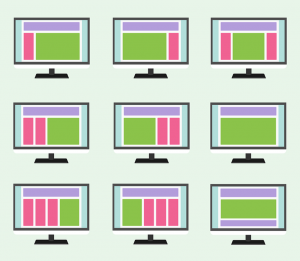
Some websites have great content, but, unfortunately, they also have poor layouts that limit their potential for success. These are the main criteria to consider when choosing your layout:
- Responsiveness: Does the website need to adapt to different screens? You could create separate websites for each device type, or mobile apps + websites, but having a responsive website is always recommended. You don’t want to miss any traffic because the website doesn’t load properly.
- Device Screen Size: Small screens cannot have the same number of columns as larger ones; the images may need to be smaller, among other considerations. E.g: The iPhone SE has a very small screen, and it's used by a big-enough percentage of iPhone users. Sidebars are not a good idea on these devices.
- Orientation: If you are using a tablet or mobile phone, you can rotate your screen which will require the website width to adjust and become bigger (for landscape) or smaller (for portrait).
- Common Sense: This is a tricky one, but you will never know what works best until you try. Perhaps moving a website menu from the top to the left will increase user engagement. You must always be in constant search for "the truth" about your user behavior.
Layout Examples
The following examples gather a large percentage of the most used layouts on the web. Understand them well because you will probably use them throughout the rest of your life as a developer. Sometimes you will use a mixed approach to accomplish several things at the same time.
Centered Content
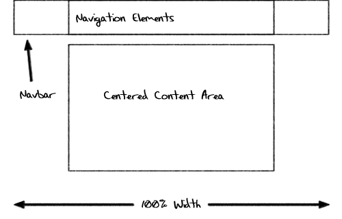
Facebook is like this: a centered content website has a max-width for the content. This means that it doesn’t matter if the client computer has a 4000px width, the website width will stop at "max-width" and the rest of the page will be white.
Here is the exact code needed for website content to always be aligned at the center of the screen:
Left Sidebar Fixed
Left sidebars are great when you have a widescreen (landscape). You can have a menu, some ads, a newsletter sign-up call to action, a login form, etc. And you can still have enough space for content! Almost every website uses a left sidebar these days, some of them include also a right sidebar.
This pre-work website has a left sidebar, and it's a great option for us because we want to have the syllabus permanently available for our students.
Top Menu with Left Sidebar
This is almost the same, but instead of having the left-sidebar as the primary menu, you will use it for complementary content. The main menu should be at the top box because is the first thing users see when they land on the website.
Responsive Masonry
Pinterest made this layout universally known. By using this "innovative" UI, they became one of the most visited websites in the world. Masonry distributes the containers in an optimal way: first fills the whole row by appending boxes to the right (adding them at the end), and then jumping to the next row when there is no longer space available.
Another great thing about Masonry is that each box can have its own height. That is challenging in CSS because some older browsers don’t support this feature yet and you will have to use Javascript to patch it.
Popups / Modal Windows / Alerts
The default Javascript alert is ugly and limited (click here to check it out). Nobody likes to use them, that’s why developers usually build their own modals.
To replicate the alert behavior you have to:
- Create a
<div>with absolute position. - Place it at the center of the screen (use auto margins for that).
- Place it in front of the website's content (use z-index rule for that).
- Add a "close" button to make the
<div>display: none; (invisible) when the user clicks on it (you have to use JavaScript to capture the user click).
Live Demo: Play with the Box
Use the sliders on the left toolbar to change the margin, padding, border radius, or any other CSS Rule available in the demo:
There is Much More to Know about Layouts
You will have to be learning "on the go" because there is an infinite amount of combinations you can create for a website layout. What really matters is that you fully understand the display, position, float and flex rules.
There is a lesson called Bootstrap that was made to facilitate the design. You'll learn this in the next lesson.

